In Celebration
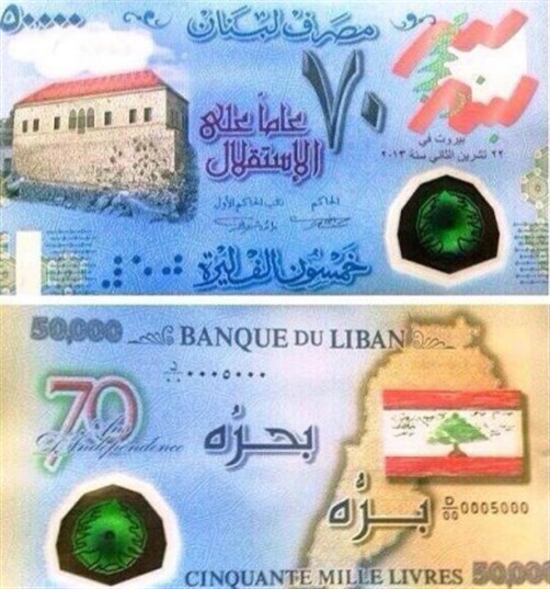
The Lebanese Central Bank has recently released a new fifty thousand Lebanese pounds bank note at the occasion of the seventieth anniversary of Lebanon’s independence on November 22. Graphic designers have been flooding the web with horrified statements about its design. Creative Directors of the biggest advertising agencies are in shock, design students are in arms, what is it that they are so troubled about?
Its aesthetics seem to be what receives the most attention. In addition to its crowded and random composition of maps, cedars and other patterns, we see a crooked Lebanese flag that should (but does not) read Lubnan, and a white stain on top of the image of a house, which should represent both a cloud and a watermark of the bank note value. What better representation of Lebanon’s urban landscapes could this ugly mix-and match layout be so characteristic of?
Spelling and grammatical mistakes are found in both languages. In Arabic, the misplacement of the fatha makes us read Msarraf [drained] instead of Masraf Lubnan (Lebanon’s Bank). On the French side of the note, Indépendance is written mixing French and English spellings (Indépendence), while the “50,000” uses the comma as a decimal mark, as per the English spelling.
Is this a scandalous revelation of the incompetence and lack of rigor of a team unable to properly proof-read a few words on a piece to be published in thousands? Or is this instead quite a revealing indication of this nation's identity issues, unable to differentiate anymore the three languages that uncontrollably mix on our TV screens, in our schools and universities, in official and commercial communication?
For a start, one would like to wonder about the paradox of a bank note celebrating the independence (from colonial France), using French language!
To add to the irony of language mistakes, a comical attempt at using Braille (incorrect as per my research) in print (and not in relief), makes it totally useless. And, what blind person could use the fifty thousands bank note anyway, while being unable to decipher any other? This is as comical as the building of ramps for disabled people at the entrance of public buildings, which then lead to stairs! This thoughtful initiative is so typical of our hypocritical concern with the image of our so-inclusive State, regardless of any consistency or functionality.
Moving on to the use of images: is it not ironic to choose a traditional Lebanese house as a national symbol, all while the country has been witnessing a massive and violent destruction of old houses in favor of high-rise buildings in the past years? Nostalgia aside, no official public attempt has been made to seriously protect the country's architectural heritage (let alone to control any gentrification process, or rise of rent prices), except maybe on this bill—the façade of the nation. Perfectly fitting, the traditional Lebanese house is here as much a nostalgic beautiful ruin, as the ancient temples of years gone by, like those of Baalback on the old one lira bank note.
Last, and definitely not least, if there should be one concern only for the designer of a bank note, it is the purely functional clarity of its value, while a huge seventy is written on this fifty thousand bill! Is it to make us feel, for one glorious second, that we are in possession of more riches than we believe?... Why not? With the persistent inflation, it makes total sense.
What seems to have been so worrying about this bank note is the image of the nation it projects. And, since graphic design enters the sphere of public debate through this door, I would like to ask why the image, and not the nation, is at the core of the debate. And if so, how have these responsible and concerned designers contributed to this image? How have they, until now, used their power to communicate to a mass (mostly unilaterally), in order to subvert and comment, to protest and shout?
While advertising and design have been wildly polluting our urban landscapes with all kinds of images, they also have been functioning mostly as machines that fabricate strategies to sell us facial creams that should make us look young and rosy, conditioners that give us long shiny black hair, chocolate that taste like nostalgia and give orgasms, cars that come with sexy ladies and cereals with happy families.
When the profession and its caretakers seem so focused on embellishing, this bank note, at the opposite, cannot pretend to be anything other than a pretty, truthful representation of this wanna-be nation. It embodies exactly a good bunch of its contradictions, including the corruption that has come to characterize our public servants so well (as such design cannot possibly have won any public bid).
Unusable for the minorities or the mass, unreadable in any language, and in total contradiction with any social or economical reality of the country, there is absolutely no need for spoofs, this bank note already looks like one.
In all cases, since we can barely buy anything with it, what exactly is it that we should all be protesting about in front of the Central Bank?
Because, indeed, msarraf Lubnan [Lebanon is drained/emptied].
Arabic edition published in al-Akhbar newspaper on Dec. 8, 2013


